Rotate images, with shadow, in all popular browsers
13 April 2011
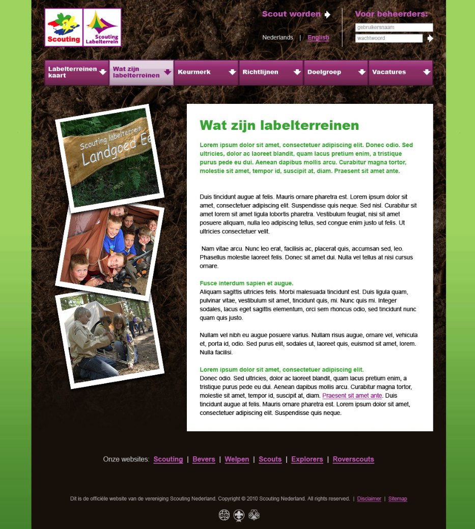
The design
 Made by the wonderful Reinier, from 3eye.nl. If you look at Scouting NL, you can see the similarities. Based on the green color-variation of the main site, which you can find by clicking Vind Scouting in the main menu on the Dutch site, or Scouting International on the English part of the website.
So green it is, with a touch of aubergine thrown into the mix.
The images
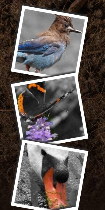
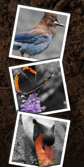
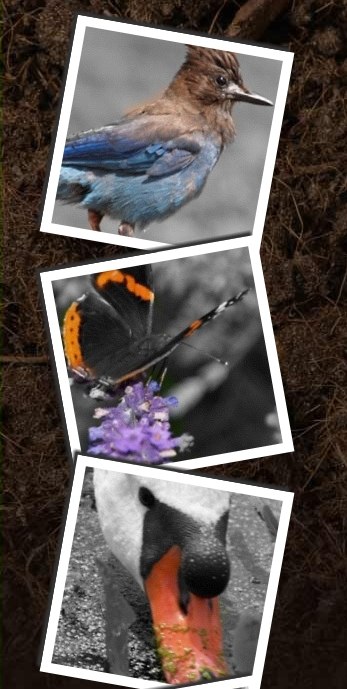
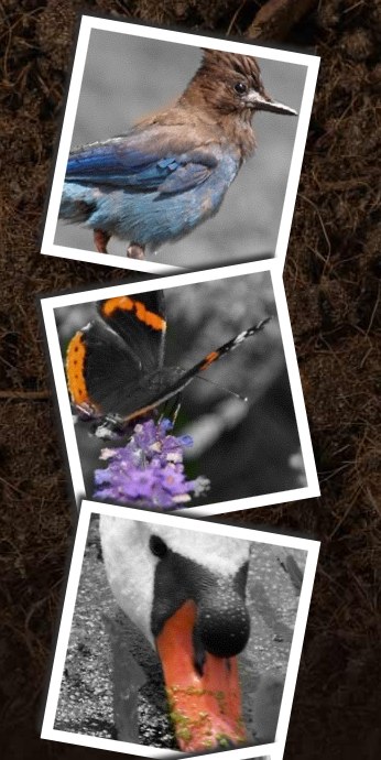
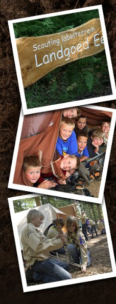 Yup. There they are, three square images, with a white border, a little shade, rotated and on top of each other. Looks really nice.
So, since we're working with Joomla (1.5.23), I first created a couple of images, 200x200px, and uploaded them to joomla's media manager.
Knowing the template we're using for Scouting NL, the best way to go here is with putting the images in a module and publish said module left of the content. So I created a custom module and simply put three images in there, without alignment, marges or border, but gave the first and third image a class "rotate-left" and the second image a class "rotate-right".
Gave the module a special module-class-suffix and that should get me started.
The white border
That one was easy. Gave the img-tag a white background and a padding of 10px.
Showed all right in all browsers. Well, some IE versions put the images close together while the rest of the browsers kept a little gap between them but since we're going to position them a little bit different anyway, I just left that alone.
Rotating the images
Here, CSS3 comes in very handy. Where we only used to be able to rotate in 90 degrees steps, we are now able to rotate in any degree we want. For that, we use the transform property. So for my "rotate-left" images, I set the property like this:
-webkit-transform: rotate(-10deg) scale(1); /* Safari and Chrome */
-moz-transform: rotate(-10deg) scale(1); /* Firefox */
-ms-transform: rotate(-10deg) scale(1); /* IE9 */
-o-transform:rotate(-10deg) scale(1); /* Opera */
transform: rotate(-10deg) scale(1); /* dunno... maybe for someday, when all browsers speak alike? */
The same for the "rotate-right" images, just with a +10deg. I probably don't need the scale(1), but haven't tried to leave it out just yet.
So far, so good, although the images are overlapping in order instead of the other way around, like in the design. Hopefully, nobody will mind :-)
Creating the shadow
With a similar technique, a shadow can be added to images. Again, we need a set of properties for the different browsers.
-moz-box-shadow: -5px -5px 5px #333333;
-webkit-box-shadow: -5px -5px 5px #333333;
box-shadow: -5px -5px 5px #333333;
We see less lines here. The -moz property is still needed for Firefox 3.6 and older, the -webkit property for Chrome and Safari, Firefox 4, Opera and IE9 are responding to the regular box-shadow.
You can use a little bit of trial and error on the values to get the right shadow, on which side do you want the shadow to appear, how thick should it be and do we need some blurring? An excellent guide to how to set the values can be found here.
The result
 Chrome |
 Firefox |
 IE9 |
 Safari |
Fixing it for IE7 and IE8
Popular browsers, huh? Well, yeah. So I needed a fix. How to get this thing working on IE7 and IE8?
That proved to be a challenge. I searched the net for hacks, work-arounds, anything.... Found some scripts, tried some, too. The most promising one seemed to be this one: CSS Sandpaper.
Installed it, tried it, got it working for all browsers EXCEPT IE7 and IE8. Thought it to be strange, as the script is designed to make this work for IE, but, to make a long story short, in my case, it didn't. The script loaded fine (you could see it "turn" the images, right after loading), so that was not the problem.
The reason I didn't investigate further in the end was that I didn't like that I had to replace ALL CSS properties to one, with a -sand-prefix, so -sand-transform, or -sand-box-shadow. Now where that is fine to do for uncooperitive browsers, I don't want to overrule the "right" way to do things with some sort of "hack".
So gave up on this one.
In the end, I went back to MicroSoft's own solution, using filters, the Shadow filter and the Matrix filter, to be precise. That also sounds a lot easier than it is... as explained here.
Especially the Matrix filter has its challenges if you are no Charlie Eppes...
Here's what finally made it work:
IE7
Since IE9 fails to do things the normal way as soon as it spots a filter for IE7, I placed this in a special IE7-stylesheet, for left-rotated images. The first filter applies the shadow, then the next does the rotating:filter: progid:DXImageTransform.Microsoft.Shadow(color=#333333,direction=320)
progid:DXImageTransform.Microsoft.Matrix(
M11=-0.9914448613738104, M12=0.13052619222005157,
M21=0.13052619222005157, M22=0.9914448613738104,
sizingMethod='auto expand');
For the right-rotated images, I switched the plus and the minus on the M11 and the M12 values. Then repositioned it all a bit, 'cause IE7 rotates differently than modern brosers and then... Phew.
IE8
/* IE8 - must be on one line. */
-ms-filter: "progid:DXImageTransform.Microsoft.Shadow(color=#333333,direction=320) progid:DXImageTransform.Microsoft.Matrix(M11=-0.9914448613738104, M12=0.13052619222005157, M21=0.13052619222005157, M22=0.9914448613738104, SizingMethod='auto expand')";
Well, did the same here, adding this IE8 specific part in a separate IE8 stylesheet. Did some repositioning here as well. Another catch here is that the filters need to be on one line of code. As soon as you know that, it finally works...
Gerelateerde links
Onderwerp
Tag
gallery